It's All in the Design
An exercise in visual analytics informs the approach for developing future usable network monitoring interfaces.
Imagine you are presented with the following scenario: A fictitious company ("Big Enterprise") has hired you to create a single, integrated graphic display design that provides network operators with situational awareness of their global network. The operators are responsible for maintaining various company services—cloud storage, streaming media, video teleconferencing, and voice-over-Internet protocol—by managing network-related issues ranging from malware threats to bandwidth allocation. Big Enterprise’s current display of multiple computer screens is difficult to understand and does not clearly show how events interrelate. The company is seeking a user-friendly design that will enable operators to balance the health, security, and performance of the network. To do so, operators will need an architecture that supports many facets of network management:
- Maintaining a clear and accurate picture of the entire network
- Detecting changes in network activity and understanding their operational impact
- Responding to issues with the best course of action
- Tracking the progress of issues as they are being identified, prioritized, and resolved
This scenario was presented in the 2013 Visual Analytics Science and Technology (VAST) “Situation Awareness Display Design” mini-challenge. A multidivisional Lincoln Laboratory team responded to the challenge, earning an honorable mention for their design’s visualization of event relationships. Diane Staheli, team lead and visualization and user interface/user experience (UI/UX) engineer in the Cyber Systems and Operations Group, attributes the design’s success to the team’s diverse composition. “We were able to consider the challenge from many unique perspectives,” she explains. The team consisted of domain experts (analysts and network operators), visual designers, and human-computer interaction experts. With this multidisciplinary team in mind, Jeffrey Gottschalk, associate leader of the Cyber Systems and Operations Group, describes the VAST mini-challenge as a “perfect fit” that “combined human-centric design skills with real-world insights from analysts.”
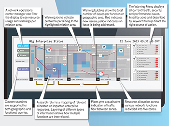
Annotated display of computer network operations explains design functionalities that facilitate situational awareness. By consulting the Warning Menu on the right hand panel, a network operator will note, for example, that in Zone 1, there is a bad link (color-coded in blue) that is being addressed (yellow).
Staheli also credits the strength of the design to the team’s approaching the challenge from an end-user perspective: “We considered what was required for a real network control center on the basis of the team’s deep experience with network operations centers and worked from there. To focus our design efforts, we imagined that a natural disaster was happening and thought about how it may play out in the cyber world, envisioning what kind of decisions the network manager would need to make. Then, we scripted a scenario to use as a working document.” Teammate Michael Snyder, a software engineer and UI/UX designer in the Intelligence and Decision Technologies Group, explains why the team chose to create this realistic scenario: “The challenge gave us no data to work with, so we had to construct the data ourselves.” He continues, “Because of this [lack of data], the mini-challenge was actually more challenging than our work at the Lab.”
Providing a holistic view of network operations, the final design displays which kinds of information and problems are important to network operators, how problems overlap and interact, and how problems impact a particular company service. This information is communicated through a multilayered, color-coded, icon-based display that enables operators to simultaneously view a variety of information to gain and maintain situational awareness.
The display divides the network into five zones to portray connectivity needs and network users for each company service (“mission area”). “Pipes” show traffic flow between zones, while overlapping of network assets shows how resources are allocated and interconnected. Color-coded warning bubbles reveal the total number of problems per function or geographic area and problem resolution-status. Heart, shield, and clock symbols are featured throughout the display to alert operators of issues relating to the health, security, and performance of the network. A warning menu features color-coded pill icons indicating which mission areas are most affected and whether or not the issue is being addressed. Operators can switch display views to see network warnings and resource usage in each mission area.
How can this exercise in visual analytics be useful? According to Staheli, the challenge was a “good opportunity to think about a problem creatively without the constraints of writing a realistic algorithm or implementing a functional system.” This type of creative thinking can then be applied when a concept needs to be realized in an operational context. “Is this design concept something we can execute by using data that are already available at the Lab?” Staheli wonders. Maureen Hunter, a network traffic analyst in the Laboratory’s Cyber Systems and Operations Group, says she would definitely use the display operationally: “Our design fuses together information that you typically would get only by consulting five to ten different sources. It combines the best of multiple monitors to provide one visual area.”
This exercise relates to other cyber work, such as the Lincoln Laboratory Cyber Situational Awareness program, which provides a platform for network defenders to monitor network activity, as well as projects involving UI/UX design and text analytics. Alongside feedback from pilots and image analysts, Snyder is also developing a quick-reaction-capability (QRC) program that provides an intuitive interface for ground situational awareness. Thinking of this project and the mini-challenge, he emphasizes the importance of usability and visualization: “A system can have the fastest and most accurate algorithms, but if end users can’t intuitively work with the results, it’s difficult to label the system a success.” Similar to the mini-challenge display, the QRC program features colors and icons, design elements that highlight essential information to help end users view flight paths and plan missions. For Snyder, the challenge also brings to mind how visual analytics has parallels to text analytics, as built into document-searching software like Structured Knowledge Space, a military intelligence reporting search and discovery system: “Different branches of the military need to mine through hundreds of thousands of report documents, a task that may be aided by visual display tools that make data more manageable. For instance, documents could be shown as pins on a map to geographically indicate where they originated.” Hunter also sees the value of visual display tools in working with histograms, graphs, and other visualizations to detect network traffic anomalies.
There is certainly a desire for more usable interfaces, as evidenced by an increased demand from sponsors. “With military personnel facing assignment changes every two years, they need software that does not require extensive training” to ease the learning period that comes with each transition, Staheli explains. Snyder adds that some sort of standardized visualization framework would be helpful because personnel who shift locations often have to learn new tools while disregarding the tools they learned in previous deployments. In particular, Combatant Commands have been asking for an integrated display operating on a single system instead of multiple systems at once. “The situational awareness challenge helps inform our [Lincoln Laboratory’s] thinking in how we would approach this kind of request,” says Staheli. Hunter says that network analysts can use these types of interfaces to acquire network intelligence that would inform decision makers about areas of foreign interest and attempts to compromise data.
The exercise also highlighted some of the challenges associated with information visualization, a field that Snyder believes is growing increasingly more important. For one, advances in screen resolution and size (think HDTV resolution and billboard-sized screens) are “great for end users but problematic for designers who have to accommodate more information in a single view and in greater detail,” explains Snyder. In fact, Snyder mentions that the team experienced this problem of “clutter” while designing their mini-challenge display and had to come up with a way to reduce but not remove the information. At the other extreme, advances in wearable mobile interface technologies, such as Internet-enabled wristwatches and Google Glass, have considerably smaller displays that will “require interaction designers to think about how visualization may be utilized beyond the form factor of the browser,” says Staheli.
A larger challenge is that of data management. One of the major concerns is being able to navigate through the wealth of data, such as that arising from social media. Analysts need to easily consolidate and sift through Internet forums, blogs, social networks, photograph-sharing sites, and other social media outlets in order to find terrorist networks, for instance. Even in looking at one social platform at a time, there are issues. “When following Twitter for cyber threat events, analysts see Twitter messages that stream separately from their other real-time graph displays. This separation means that analysts must consider whether a Twitter message relates to other live activity sensors,” Hunter explains. Another challenge is that data are rarely in the same format, making integration of information from various sources into a single platform difficult, especially when restrictions such as access controls and firewalls are encountered. Data visualization also becomes difficult when users do not know what is in the data at hand or what they need from the data. “It’s like working with a blank canvas,” says Snyder.
At a more basic level, many different approaches to visual analytics are available. “Some users may prefer to see all available information at a glance, other users may want a customized view specific to their needs, and yet others may seek an interactive experience,” Staheli explains. Snyder thinks a display that allows users to switch between different views and “hide” less relevant information may help avoid alienating users who are accustomed to a certain approach. Nonetheless, he agrees that this split in visual analytics is a tough act to balance: “Oftentimes, users may have one vision in mind, but they overlook the problems associated with that vision or fail to realize that multiple display options exist. Yes, there are bad ‘answers,’ but no, there is not one right ‘answer.’”
Despite these differences in opinion, one point is agreed upon: it’s all in the design.
|